The Art of the Rebrand
Rebrands get talked about like they are big, dramatic resets. New logo, new colors, new everything. But most of the time, that is not what a brand actually needs. The strongest rebrands are usually more restrained. They are about refinement, not reinvention. It is less about throwing everything out and more about understanding what is already working, then building on top of it with more clarity and intention.
Every brand builds equity over time. That equity lives in small things. A familiar shape. A certain color. The way a name is styled. Even if the execution is outdated, there is often something worth holding onto. When you strip all of that away too aggressively, you risk losing recognition and trust that took years to build.
The approach we take is to study the existing identity closely before making any moves. What do people actually recognize? What feels ownable? What has the potential to evolve rather than be replaced? From there, the goal is to simplify, sharpen, and modernize without losing the core DNA. Sometimes that means tightening typography and spacing so a mark feels more confident. Sometimes it is reworking proportions so a logo scales better across real world applications. Other times it is introducing a more disciplined system around color, layout, and imagery so the brand feels cohesive instead of scattered.
The end result should feel familiar, but noticeably better. Like the brand has grown up without forgetting where it came from. A good rebrand should not chase trends. It should create something that can hold up over time and across different touchpoints as the company grows. It should feel intentional, not overdesigned. Clear, not complicated.
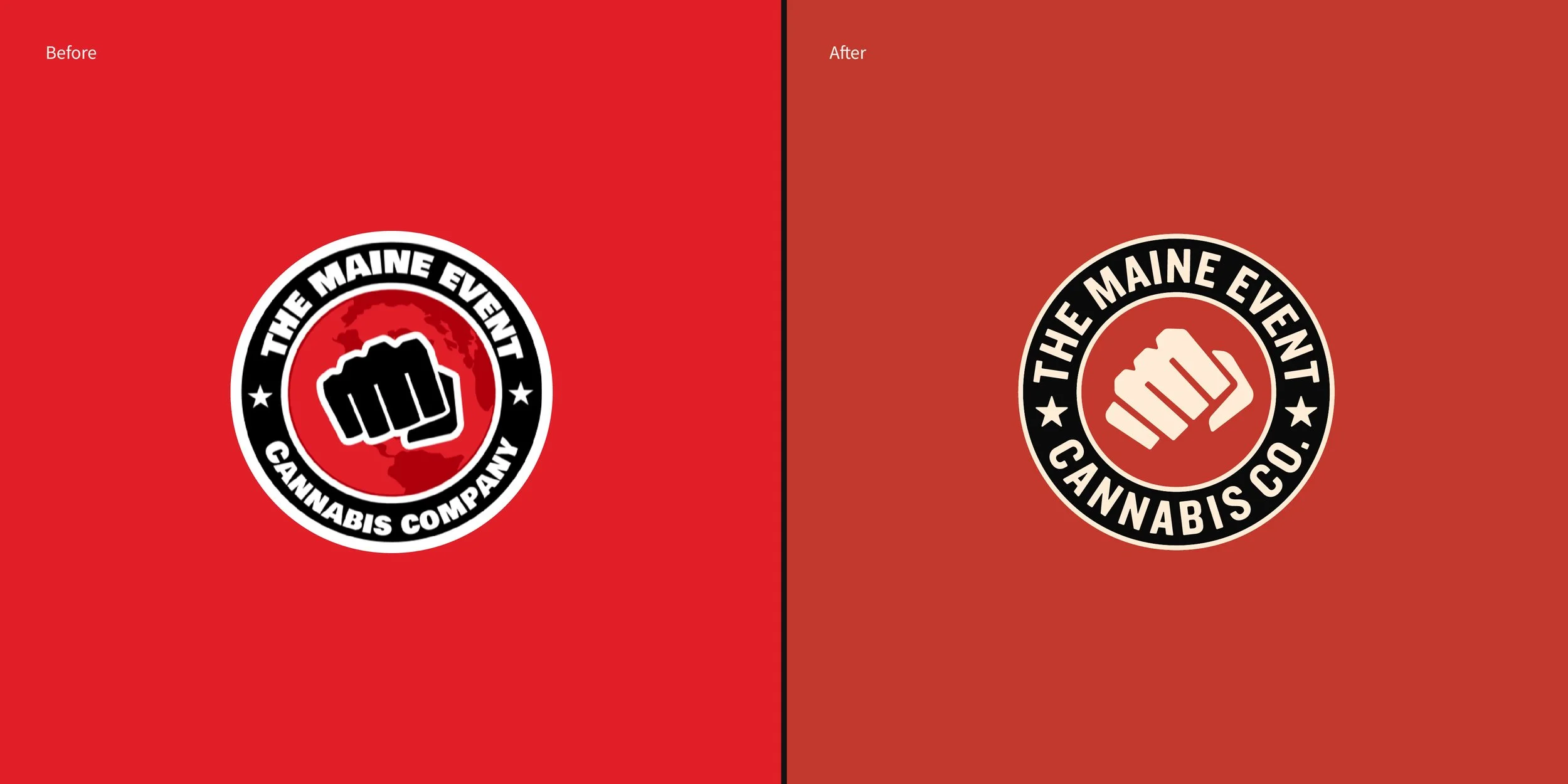
Below is a selection of rebrands that follow that thinking. Some are subtle shifts. Others are more involved. All of them are rooted in the same idea: respect what exists, refine what matters, and build something that lasts.
L1D Capital
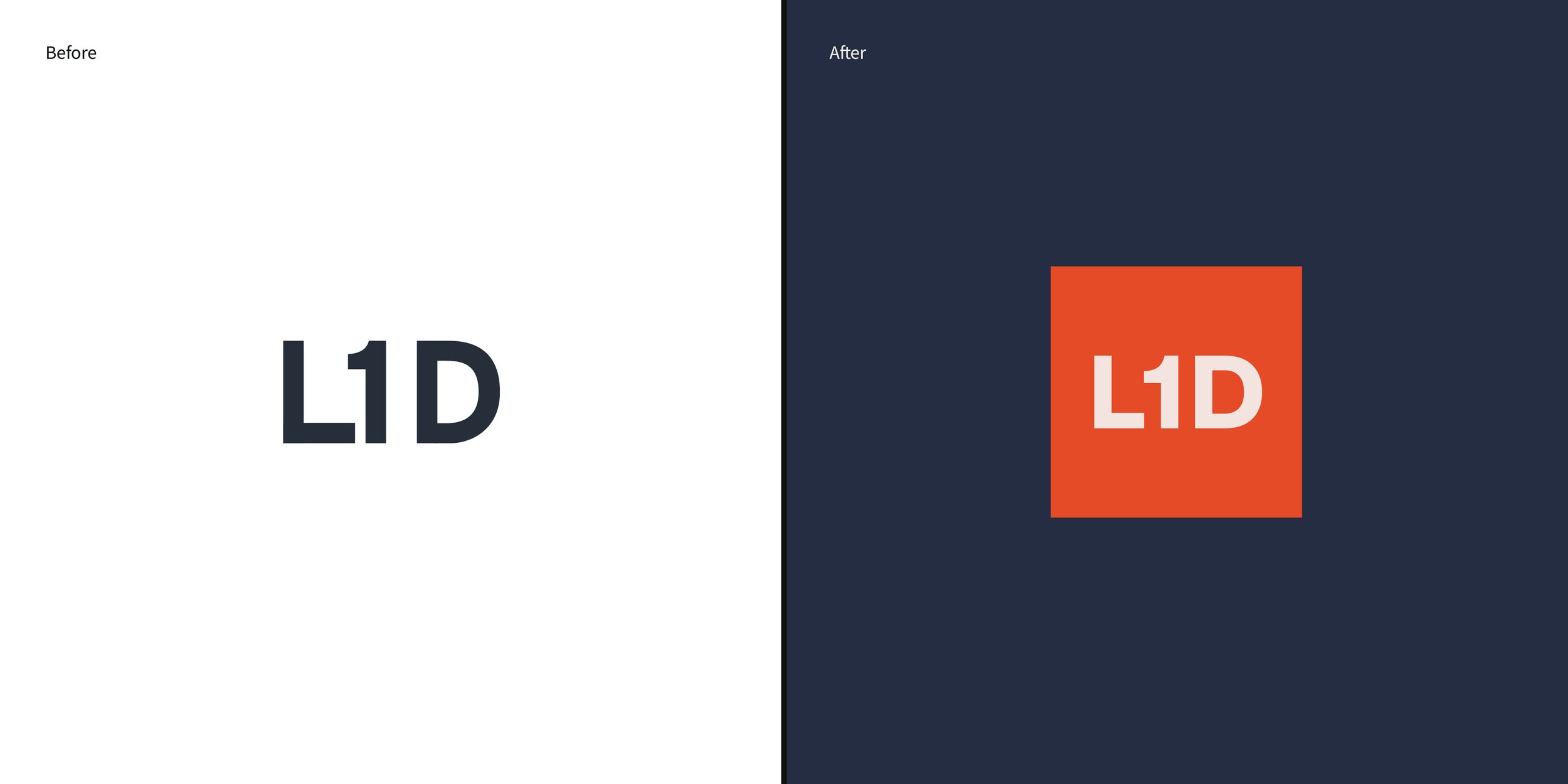
L1D capital had a brand identity before they approached us. It felt more typed out than a true, memorable mark — but they wanted to maintain the equity they had already built. We took the core of their previous identity and expanded on it. We created a custom L1D monogram balanced for scale and legibility, and encased it in an orange square that becomes a memorable identifier for the brand. We also developed a more modern color palette, adding a vibrant orange to the navy blue and burnt orange that already existed.
Proxy Financial
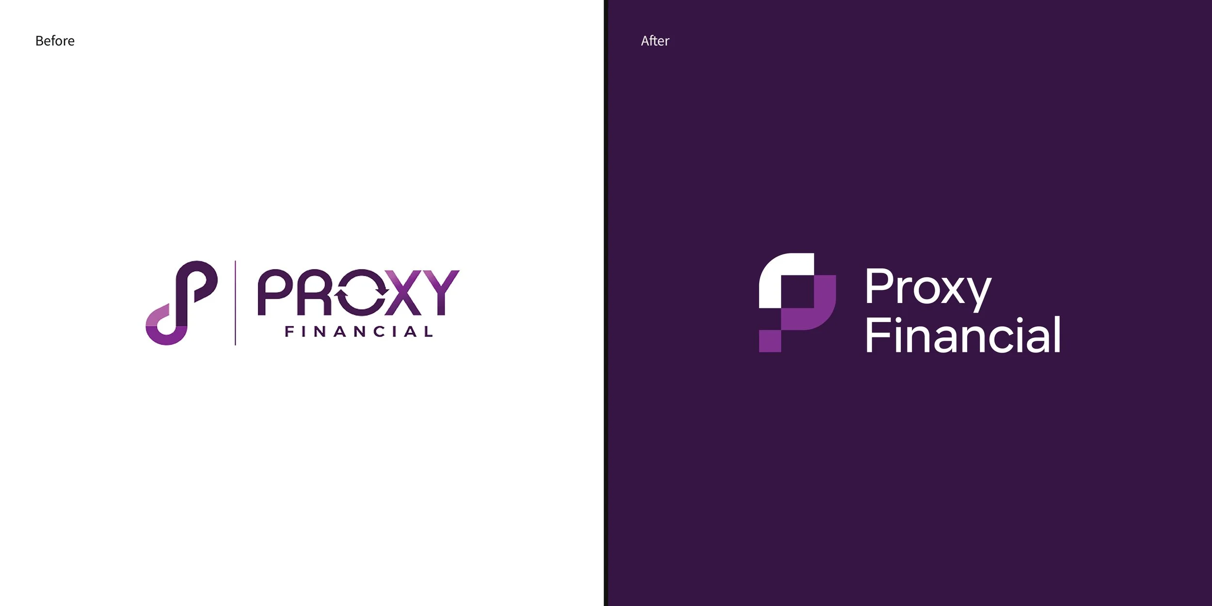
Proxy Financial’s old identity had too many elements going on, resulting in a logo that doesn’t feel confident or memorable. We wanted to create one singular mark that had had intention and strength, increasing the memorability and creating a brand that instilled trust in potential customers.
Matt’s Music
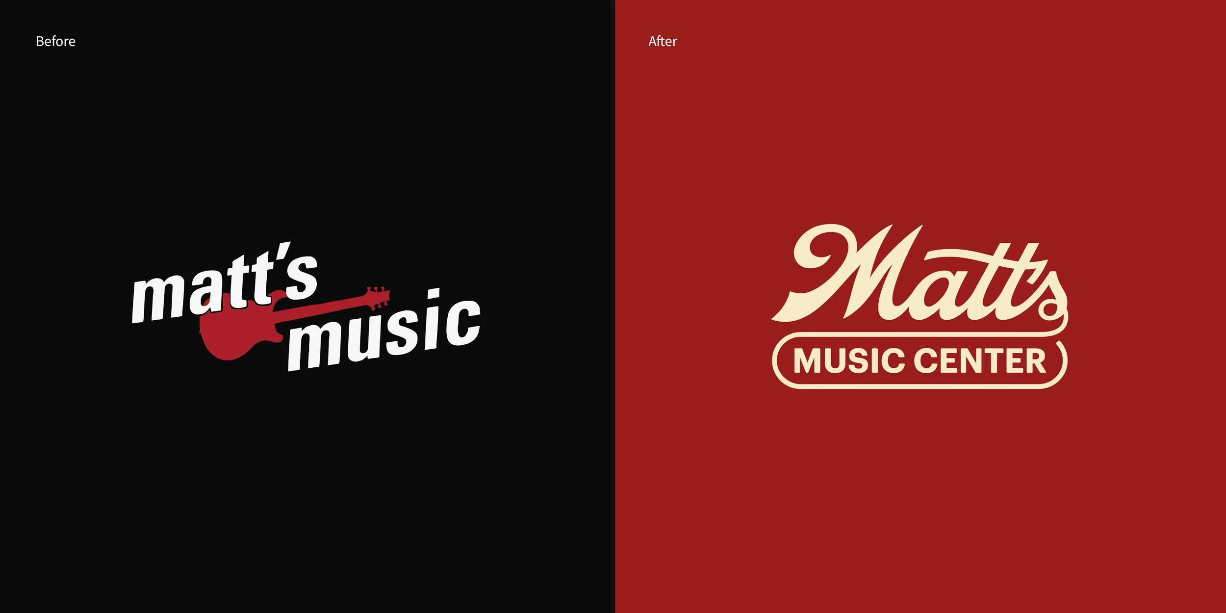
Matt’s Music had a